Originally posted by core memory:
that typeface, its surely too �Jazzy� for John! Bring back the old impersonal typography of previous releases, and leave all that �old new romanticism� look for Elly Jackson.
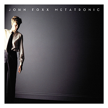
When I first saw the Metatronic cover that font made me think of Fritz Langs Metropolis, I was convinced it was the font on the movie poster! Wrong, its so not

its funny how you get these mistaken associations in your head though. I think we need to (jokingly) blame Alex S for his bringing the La Roux similarity to our attention, unfortunately I can't stop seeing her in my mind now.
Should John just stick to his usual font/style? ie, the one we've become used to in recent times, surely its become a brand for him now.
As regards the present Metatronic font, with its 20's/30's associations I could just imagine Spandau Ballet or Modern Romance going for something like it, not that I'm saying they would have, but you never know...
Any 'font experts' on the forum at all, would John suit a 40's, 50's or a 60's font? does his music better suit a particular retro age in that 'future retro' sense.